Matplotlib: Bar Graph/Chart
A bar graph or bar chart displays categorical data with parallel rectangular bars of equal width along an axis. In this tutorial, we will learn how to plot a standard bar chart/graph and its other variations like double bar chart, stacked bar chart and horizontal bar chart using the Python library Matplotlib.
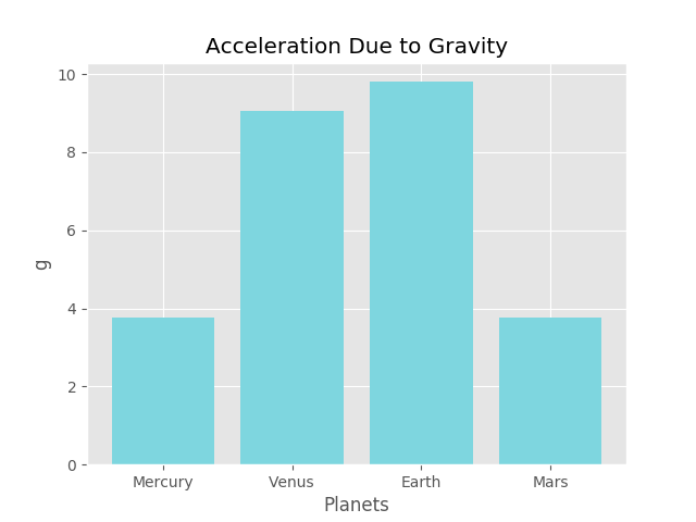
We will start with the standard bar graph. We will plot it to represent the acceleration due to gravity $g$ on Mercury (3.76$m/s^{2}$), Venus (9.04$m/s^{2}$), Earth (9.8$m/s^{2}$) and Mars (3.77$m/s^{2}$).
 Mercury, Venus, Earth and Mars. Public Domain
Here we use one of the many predefined styles available in Matplotlib, called 'ggplot', which we pass as an argument to the use() function belonging to the style package.
					import matplotlib.pyplot as plt
					import numpy as np
					plt.style.use('ggplot')
					x = ['Mercury', 'Venus', 'Earth', 'Mars']
					g = [3.76,9.04,9.8,3.77]
					x_pos = np.arange(len(x))
					plt.bar(x_pos, g, color='#7ed6df')
					plt.xlabel("Planets")
					plt.ylabel("g")
					plt.title("Acceleration Due to Gravity")
					plt.xticks(x_pos, x)
					plt.show()
You can save this program as bar.py inside some directory, say, /python-programs, navigate to it and run it.
$python3 bar.py
The generated graph looks as follows:
Double Bar Chart/Graph
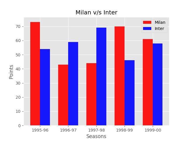
Two bar charts can be plotted side-by-side next to each other to represent categorical variables. Such a graph is known as a double bar chart. In the example below, we plot a double bar chart to represent the number of points scored by AC Milan and Inter between the seasons 1995-96 and 1999-00, side-by-side.
 Inter v/s Milan. Nov. 24, 1996, San Siro. Public Domain
						import numpy as np
						import matplotlib.pyplot as plt
						plt.style.use('ggplot')
						n = 5
						milan= (73, 43, 44, 70, 61)
						inter = (54, 59, 69, 46, 58)
						fig, ax = plt.subplots()
						index = np.arange(n)
						bar_width = 0.35
						opacity = 0.9
						ax.bar(index, milan, bar_width, alpha=opacity, color='r',
						                label='Milan')
						ax.bar(index+bar_width, inter, bar_width, alpha=opacity, color='b',
						                label='Inter')
						ax.set_xlabel('Seasons')
						ax.set_ylabel('Points')
						ax.set_title('Milan v/s Inter')
						ax.set_xticks(index + bar_width / 2)
						ax.set_xticklabels(('1995-96','1996-97','1997-98','1998-99','1999-00'
						    ))
						ax.legend()
						plt.show()
Clustered Bar Chart/Graph
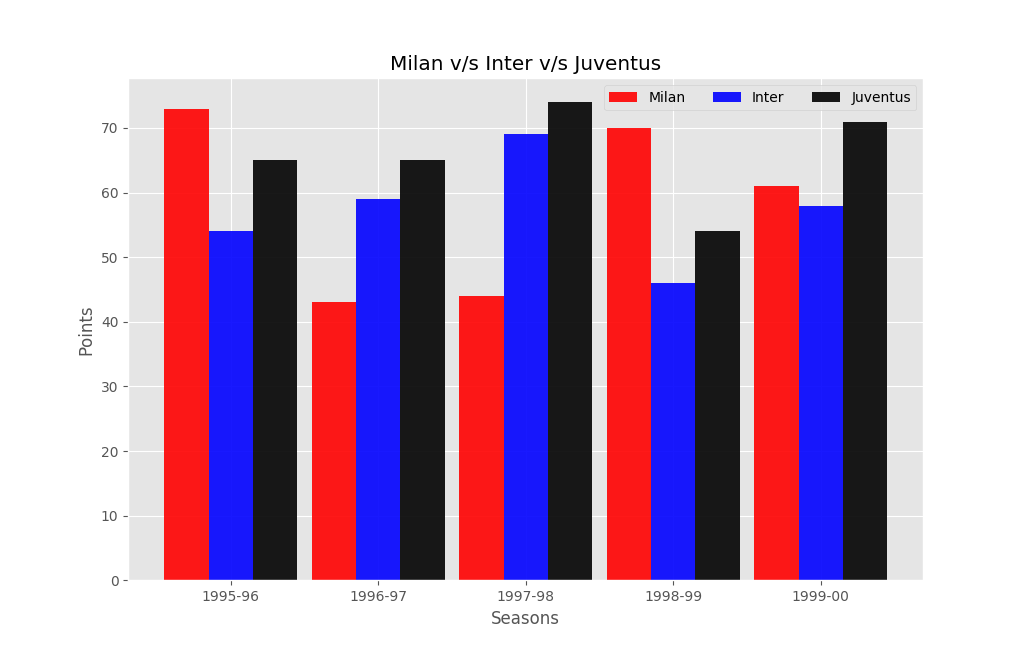
We can also place more than two bar graphs next to each other. Let us add the points scored by Juventus to our graph in the above example. Collectively, such graphs as know as clustered bar charts. A double bar chart is also a clustered bar chart. This time we place the legend hoizontally by setting ncol=3 inside the legend() function.
						import numpy as np
						import matplotlib.pyplot as plt
						plt.style.use('ggplot')
						n = 5
						milan= (73, 43, 44, 70, 61)
						inter = (54, 59, 69, 46, 58)
						juventus = (65, 65, 74, 54, 71)
						fig, ax = plt.subplots()
						index = np.arange(n)
						bar_width = 0.3
						opacity = 0.9
						ax.bar(index, milan, bar_width, alpha=opacity, color='r',
						                label='Milan')
						ax.bar(index+bar_width, inter, bar_width, alpha=opacity, color='b',
						                label='Inter')
						ax.bar(index+2*bar_width, juventus, bar_width, alpha=opacity,
							color='k', label='Juventus')
						ax.set_xlabel('Seasons')
						ax.set_ylabel('Points')
						ax.set_title('Milan v/s Inter v/s Juventus')
						ax.set_xticks(index + bar_width)
						ax.set_xticklabels(('1995-96','1996-97','1997-98','1998-99','1999-00'
						    ))
						ax.legend(ncol=3)
						plt.show()
Stacked Bar Chart/Graph
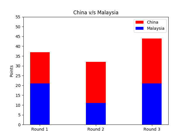
Also, data can be represented by stacking one on top of the other in vertical columns. Such graphs are known as stacked bar charts. We will illustrate it by displaying the final results of the men's doubles badminton tournament at the 2016 Summer Olympics at Riocentro, Brazil, between the shuttlers from China and Malaysia scoring 16-21, 21-11, 23-21 in the first, second and third rounds respectively.
						import numpy as np
						import matplotlib.pyplot as plt
						n = 3
						china = (16,21,23)
						malaysia = (21,11,21)
						x = np.arange(n)
						width = 0.35
						p1 = plt.bar(x, malaysia, width, color='b')
						p2 = plt.bar(x, china, width, color='r', bottom=malaysia)
						plt.ylabel('Points')
						plt.title('China v/s Malaysia')
						plt.xticks(x, ('Round 1', 'Round 2', 'Round 3'))
						plt.yticks(np.arange(0, 60, 5))
						plt.legend((p2[0], p1[0]), ('China', 'Malaysia'))
						plt.show()
Horizontal Bar Chart/Graph
Bars can be plotted horizontally too. We will represent the maximum speeds of the following hyper cars as a horizontal bar graph: Bugatti Chiron (420 km/h), Hennessey Venom F5 (435 km/h) and Koenigsegg Agera RS (457 km/h). In the Python code below, the bar colours are set separately for each car inside barh() as color='kyr' (k - black, y - yellow, r - red). The left margin for the $y$-axis is achieved by setting left=0.3 inside the subplots_adjust() function.
 Hennessey Venom F5 by Alexander Migl. CC BY-SA 4.0
						import matplotlib.pyplot as plt
						import numpy as np
						fig, ax = plt.subplots()
						cars = ('Bugatti Chiron', 'Hennessey Venom F5', 'Koenigsegg Agera RS')
						y = np.arange(len(cars))
						speeds = [420,435,457]
						ax.barh(y, speeds, align='center',
						        color='kyr', ecolor='black')
						ax.set_yticks(y)
						ax.set_yticklabels(cars)
						ax.invert_yaxis()
						ax.set_xlabel('Top Speed (km/h)')
						plt.subplots_adjust(left=0.3)
						plt.show()

Matplotlib Examples
Additionally, you may go through the various examples for each graph type available in the official Matplotlib site, the specific links to which are listed in the section below.
Notes
- Clustered/Group Bar Charts — https://matplotlib.org/gallery/units/bar_unit_demo.html
- Stacked Bar Charts — https://matplotlib.org/gallery/lines_bars_and_markers/bar_stacked.html
- Horizontal Bar Charts — https://matplotlib.org/gallery/lines_bars_and_markers/barh.html