Matplotlib: Histogram
A histogram is a diagrammatic representation of data as rectangles whose area is proportional to the class frequencies and whose width is equal to the class bin/interval. Unlike in a bar chart, the bars in a histogram can be of unequal width. If all the class intervals are of equal length, then the heights are proportional to the numbers.
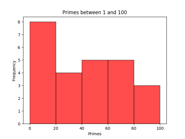
In this tutorial, we will take as data the number of primes between 1 and 100 and create a histogram out of it using the the Matplotlib function hist().
We specify the bins (or intervals) between 0 and 100 as [0,20,40,60,80,100]. The first bin is [0, 20), which includes 0, but excludes 20. However, the last bin [80,100], includes 100.
Inside the hist() function, the facecolor property sets the colour of the bars (we set it to r - red); the alpha property sets its opacity and takes in values from 0 to 1. But the bars without an outline would look indistinguishable, so we set the edgecolor with a darker colour (say, k - black) of width 1 (linewidth = 1).
					from matplotlib import pyplot as plt
					import numpy as np
					a = np.array([2,3,5,7,11,13,17,19,23,29,31,37,41,43,47,53,59,61,67,
						71,73,79,83,89,97])
					bins = [0,20,40,60,80,100]
					plt.hist(a, bins, facecolor='r', alpha=0.7, edgecolor='k', linewidth=1)
					plt.title("Primes between 1 and 100")
					plt.xlabel("Primes")
					plt.ylabel("Frequency")
					plt.show()
If you save the above Python program as histogram.py, you can run it typing the command
$python3 histogram.py
We can specify the bins with just the number of intervals you require. The statement bins = [0,20,40,60,80,100] in the above program can be replaced by bins = 5.
					from matplotlib import pyplot as plt
					import numpy as np
					a = np.array([2,3,5,7,11,13,17,19,23,29,31,37,41,43,47,53,59,
						61,67,71,73,79,83,89,97])
					bins = 5
					plt.hist(a, bins, facecolor='r', alpha=0.7, edgecolor='k',
						linewidth=1)
					plt.title("Primes between 1 and 100")
					plt.xlabel("Primes")
					plt.ylabel("Frequency")
					plt.show()
It will generate the same graph as above.
Multiple Histograms
Now let us plot two histograms in a single graph. We will consider another set of data between 1 and 100, say, exponents $n$ which give Mersenne Primes.
 (Marin Mersenne via Wikimedia Commons, Public Domain
Mersenne Primes are prime numbers of type $2^{n} - 1$, for some integer $n$. Below are the exponents $n \lt 100$ which give Mersenne Primes:
[2, 3, 5, 7, 13, 17, 19, 31, 61, 89]
In our below Python program, we create another array b for it. Also note that there are 10 equal class intervals here, assigned to bins .
					from matplotlib import pyplot as plt
					import numpy as np
					a = np.array([2,3,5,7,11,13,17,19,23,29,31,37,41,43,47,53,59,61,67,
						71,73,79,83,89,97]) # primes
					b=np.array([2,3,5,7,13,17,19,31,61,89]) # exponents
					bins = [0,10,20,30,40,50,60,70,80,90,100]
					plt.hist([a,b],bins,label=['Primes','Exponents for Mersenne Primes'])
					plt.legend(loc='upper right')
					plt.title("Primes & Exponents for Mersenne Primes")
					plt.xlabel("Primes & Exponents for Mersenne Primes")
					plt.ylabel("Frequency")
					plt.show()
On execution, the program plots the following graph.

Notes
-
If you do not want any outline on the bars, set
edgecolor=noneinside thehist()function.