React/ReactJS: Datepicker
A front-end developer most probably has come across a datepicker in the form of a jQuery or a Bootstrap widget.
In this tutorial, we will have a look at one of the most popular datepicker packages for React.

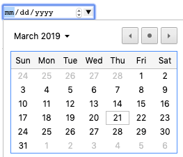
Although today we also have the HTML5 <input/> element of type="date" for the same purpose, a datepicker is still preferred from the perspective of usabilty and easier customizability.
 An HTML5
 <input/> element of type="date"
Besides, the type="date" has browser compatibility issues: it is not supported in Safari & IE. Also, the jQuery datepicker has been around for years much before the advent of HTML5 <input type="date"/>.
There exists a similar package for ReactJS also: react-datepicker.
In the earlier versions, there was a dependency on the moment package. But this isn't the case anymore now, as they have adopted the native Date object so we can skip the installation.
Install the react-datepicker Node.js package.
npm i react-datepicker --save
We create a class component called <PickDate/> to wrap our datepicker. Note the imported CSS from the installed package into the component: import 'react-datepicker/dist/react-datepicker.css'
					import React, { Component } from 'react';
					import DatePicker from 'react-datepicker';
					import 'react-datepicker/dist/react-datepicker.css';

					class PickDate extends Component {
					  constructor(props) {
					    super(props);
					    this.state = {
					      date: new Date()
					    };
					    this.dateChange = this.dateChange.bind(this);
					  }

					  dateChange(date) {
					    this.setState({
					      date: date
					    },
					     () => {
					      console.log(this.state.date);
					    });
					  }

					  render() {
					    return (
					      <div>
					        <p>
					          Pick a date:
					        </p>
					        <DatePicker selected={this.state.date} onChange={this.dateChange}/>
					      </div>
					    );
					  }
					}

					export default PickDate;
If the above component <PickDate/> is to be saved as a file, say Date.js, then we can import it into index.js and see how it works.
					import Date from './Date';
					...
					...
					ReactDOM.render(<Date/>, document.getElementById('root'));
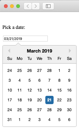
Upon rendering, the component appears as below.

The date can be picked, and upon picking a date, the selected date gets printed in the browser console (see the console.log() statement inside the dateChange() function).
Date Formats
Now in most web projects, we do not want the default format. We prefer a reader-friendly format, something like . There is a dateFormat attribute for it, where we specify the format type as its value. The following code generates the date in the format .
						<DatePicker selected={this.state.date} onChange={this.dateChange}
							dateFormat="MMMM d, yyyy"/>
If you need an abbreviated three-letter month format, use MMM, or if you just need a number, use MM. If the year is to be shortened to just the last two digits, use yy or YY.
There is an ample lot of examples on formatting date and time here: https://reactdatepicker.com/