Matplotlib: Graph/Plot a Straight Line
The slope equation $y=mx+c$ as we know it today is attributed to René Descartes (AD 1596-1650), Father of Analytic Geometry.
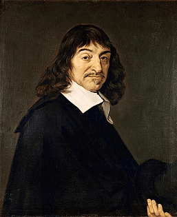 Portrait of René Descartes (1596-1650)
by After Frans Hals. Public Domain
Portrait of René Descartes (1596-1650)
by After Frans Hals. Public Domain
The equation $y=mx+c$ represents a straight line graphically, where $m$ is its slope/gradient and $c$ its intercept. In this tutorial, you will learn how to plot $y=mx+b$ in Python with Matplotlib.
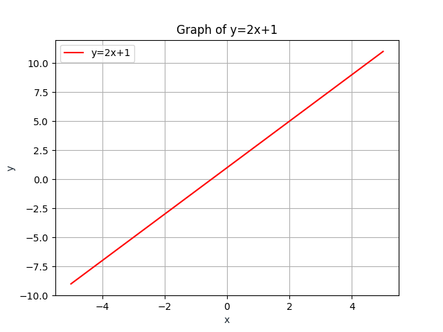
Consider the straight line $y=2x+1$, whose slope/gradient is $2$ and
intercept is $1$. Before we plot, we need to import
NumPy and use its
linspace() function to create
evenly-spaced points in a given interval. In the below example,
linspace(-5,5,100) returns 100 evenly
spaced points over the interval [-5,5] and this array of points goes
as the first argument of the
plot() function, followed by the function
itself, followed by the linestyle (which is
'-' here) and colour ('r', which stands for red) in
abbreviated form. The last argument is the label for the legend.
					import matplotlib.pyplot as plt
					import numpy as np
					x = np.linspace(-5,5,100)
					y = 2*x+1
					plt.plot(x, y, '-r', label='y=2x+1')
					plt.title('Graph of y=2x+1')
					plt.xlabel('x', color='#1C2833')
					plt.ylabel('y', color='#1C2833')
					plt.legend(loc='upper left')
					plt.grid()
					plt.show()
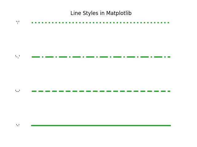
There are many other line-styles available in Matplotlib besides
-.
And the same goes for the colour. Below you can check out the remaining basic in-built colours.
- b: blue
- g: green
- r: red
- c: cyan
- m: magenta
- y: yellow
- k: black
- w: white
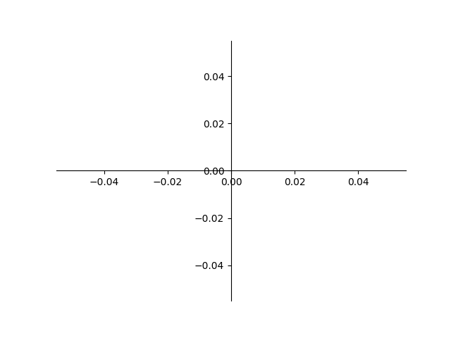
Positioning the Axes at the Centre
When we plot a line with slope and intercept, we
usually/traditionally position the axes at the middle of the graph.
In the below code, we move the left and bottom spines to the center
of the graph applying
set_position('center'), while the right
and top spines are hidden by setting their colours to none with
set_color('none'). The
set_ticks_position() function sets the
position for the graduations along the applied axis.
						import matplotlib.pyplot as plt
						fig = plt.figure()
						ax = fig.add_subplot(1, 1, 1)
						ax.spines['left'].set_position('center')
						ax.spines['bottom'].set_position('center')
						ax.spines['right'].set_color('none')
						ax.spines['top'].set_color('none')
						ax.xaxis.set_ticks_position('bottom')
						ax.yaxis.set_ticks_position('left')
						plt.plot()
						plt.show()
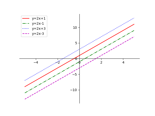
Multiple Straight Lines
We now plot multiple lines in the same graph, positioning the axes at the centre.
						import matplotlib.pyplot as plt
						import numpy as np
						fig = plt.figure()
						ax = fig.add_subplot(1, 1, 1)
						x = np.linspace(-5,5,100)
						ax.spines['left'].set_position('center')
						ax.spines['bottom'].set_position('center')
						ax.spines['right'].set_color('none')
						ax.spines['top'].set_color('none')
						ax.xaxis.set_ticks_position('bottom')
						ax.yaxis.set_ticks_position('left')
						plt.plot(x, 2*x+1, '-r', label='y=2x+1')
						plt.plot(x, 2*x-1,'-.g', label='y=2x-1')
						plt.plot(x, 2*x+3,':b', label='y=2x+3')
						plt.plot(x, 2*x-3,'--m', label='y=2x-3')
						plt.legend(loc='upper left')
						plt.show()