Matplotlib: Plot
The plot() function plots the $y$ versus $x$ graph as lines and/or markers. It is one among the many command-like functions of the matplotlib.pyplot interface. The typical examples of the $y$ vs $x$ graphs we come across in school are the distance-time graphs (distance along the $y$-axis, time along the $x$-axis), speed-time graphs, period-length graphs of a simple pendulum, etc. In this tutorial, we pick the temperature-time graphs to plot using the plot() function.
Consider the monthly average temperatures (°C) in Singapore, as given by https://www.holiday-weather.com/. We represent them in a one-dimensional array.
[26,27,27,27,27,27,27,27,27,27,26,26]
 Skyscrapers near Singapore River by Merlion444, via Wikimedia Commons. Public Domain
We provide this array as a single argument to the plot() function in the program below.
					import matplotlib.pyplot as plt
					plt.plot([26,27,27,27,27,27,27,27,27,27,26,26])
					plt.ylabel('Temperature (°C)')
					plt.show()
Matplotlib assumes this to be the set of values along the $y$-axis (ordinates) and auto creates the $x$ values of the same length. Save this program as temperature.py inside some directory, say, /python-programs. Next, navigate to the /python-programs directory and run it.
$python3 temperature.py
The resulting graph looks as follows:

The 0, 1, 2, ... along the $x$-axis do not indicate anything much; they can mean anything or nothing.
So let us be specific of the months. We can set the month as the array [1,2,3,4,5,6,7,8,9,10,11,12] to be plotted along the $x$-axis, where 1 means January, 2 means February, and so on. This array goes as the first argument of the plot() function and our previous array consisting of temperature values goes as the second argument. The two arrays need to be of the same length.
					x = [1,2,3,4,5,6,7,8,9,10,11,12]
					y = [26,27,27,27,27,27,27,27,27,27,26,26]
					plt.plot(x,y)
Also we now label the $x$-axis and give the title of the graph.
					plt.xlabel('Months')
					plt.title('Temperature in Singapore')
Better still, we can apply custom colours to them.
					plt.xlabel('Months', color='#1e8bc3')
					plt.title('Temperature in Singapore', color='#34495e')
Now our program becomes more complete,
					import matplotlib.pyplot as plt
					x = [1,2,3,4,5,6,7,8,9,10,11,12]
					y = [26,27,27,27,27,27,27,27,27,27,26,26]
					plt.plot(x,y)
					plt.xlabel('Months', color='#1e8bc3')
					plt.ylabel('Temperature (°C)', color='#e74c3c')
					plt.title('Temperature in Singapore', color='#34495e')
					plt.show()
and the generated graph has a meaningful abscissae.

So far, we have only seen one type of line style in blue. We can add another parameter to the plot() function and generate other types. The default value is b-, where b stands for blue and - is the line style. So, basically, we can replace the line
plt.plot(x,y)
in our above temperature.py program with
plt.plot(x,y,'b-')
and it would generate the same.
Now, besides the colour b (blue), there are other basic built-in colours. We list them below along with their single-letter codes:
- b: blue
- g: green
- r: red
- c: cyan
- m: magenta
- y: yellow
- k: black
- w: white
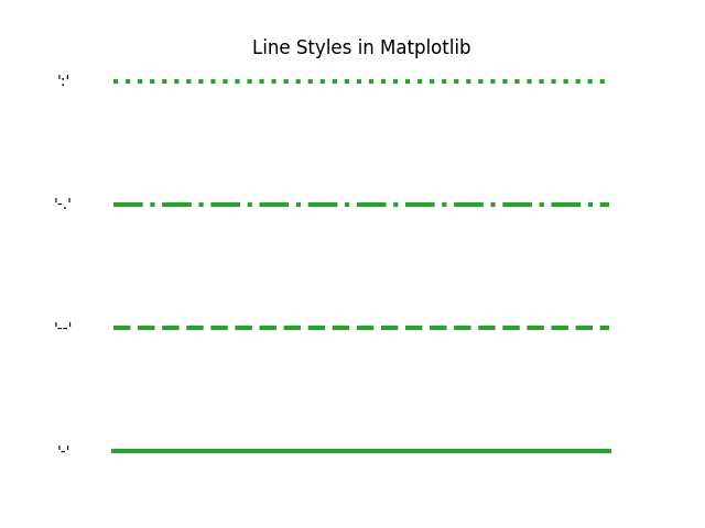
Similarly, besides - (dash), there are three other line-styles available.
Also, instead of the line, we can also use markers. For the discrete data we provided to the plot() function, the markers provide a much truer graph than the continuous graphs we plotted with lines. The possible markers in Matplotlib are listed below.


In the following, we generate a few graphs with different combinatons of colours and line styles/markers: m^ (magenta triangles), rs (red squares), g-- (green dashes), c* (cyan asterisk)


Plot Multiple Lines/Multiline Plots
Often we need to plot multiple lines on the same graph, applying different colours and line styles and/or markers to each. Let us now consider the monthly average high and low temperatures. We can overload the plot() function with $x$-$y$ (hours-temperature) list pairs as shown below.
						import matplotlib.pyplot as plt
						x = [1,2,3,4,5,6,7,8,9,10,11,12]
						y = [30,31,31,31,31,31,31,31,31,31,30,29] # average high
						z = [23,24,24,24,25,24,24,24,24,24,24,23] # average low
						plt.plot(x,y, 'm-.', x, z, 'c:')
						plt.xlabel('Months', color='#1e8bc3')
						plt.ylabel('Temperature (°C)', color='#e74c3c')
						plt.title('Temperature in Singapore', color='#34495e')
						plt.show()
Let us also add legend to the graph to identify the different lines.
						import matplotlib.patches as mpatches
						high_legend = mpatches.Patch(color='magenta', label='High')
						low_legend = mpatches.Patch(color='cyan', label='Low')
						plt.legend(handles=[high_legend,low_legend])
The consolidated code now becomes:
						import matplotlib.pyplot as plt
						import matplotlib.patches as mpatches
						x = [1,2,3,4,5,6,7,8,9,10,11,12]
						y = [30,31,31,31,31,31,31,31,31,31,30,29] # average high
						z = [23,24,24,24,25,24,24,24,24,24,24,23] # average low
						plt.plot(x,y, 'm-.', x, z, 'c:')
						plt.xlabel('Months', color='#1e8bc3')
						plt.ylabel('Temperature (°C)', color='#e74c3c')
						plt.title('Temperature in Singapore', color='#34495e')
						high_legend = mpatches.Patch(color='magenta', label='High')
						low_legend = mpatches.Patch(color='cyan', label='Low')
						plt.legend(handles=[high_legend,low_legend])
						plt.show()

Adding Markers to a Line Plot
A marker can be added right after the line style. In the below plot, we add the marker o to the line -.
						import matplotlib.pyplot as plt
						x = [1,2,3,4,5,6,7,8,9,10,11,12]
						y = [26,27,27,27,27,27,27,27,27,27,26,26]
						plt.plot(x,y, 'g-o')
						plt.xlabel('Months', color='#1e8bc3')
						plt.ylabel('Temperature (°C)', color='#e74c3c')
						plt.title('Temperature in Singapore', color='#34495e')
						plt.show()

Plotting y=f(x)
Plotting $y=f(x)$ kind of equations, both linear and non-linear (quadratic, cubic or polynomial), require creation of finer evenly spaced points in an interval and hence necessitates importing NumPy to use functions such as linspace() and arange(). Here we will not go further into any of them here as separate tutorials have been dedicated on plotting linear and non-linear equations.